This guide shows you step-by-step how to edit photos in Lightroom to make them look better, fix low-quality images, reduce noise without losing detail, and build your own cinematic preset. These are the exact settings I use for sunset and Instagram photography.
Learn how to edit a photo in Lightroom (Mobile+Desktop)
Sometimes the photo is good.
But it doesn’t feel the way it felt when you were there.
You remember the air. The warmth. The light hitting the ocean. The people walking by. The roller coaster moving against the sky. And then you open the image on your screen… and it looks flat.
If you’ve ever typed into Google:
- “How do I edit a photo to make it look better?”
- “How to fix a poor quality photo?”
- “How to edit photos for Instagram?”
This is exactly how I do it.
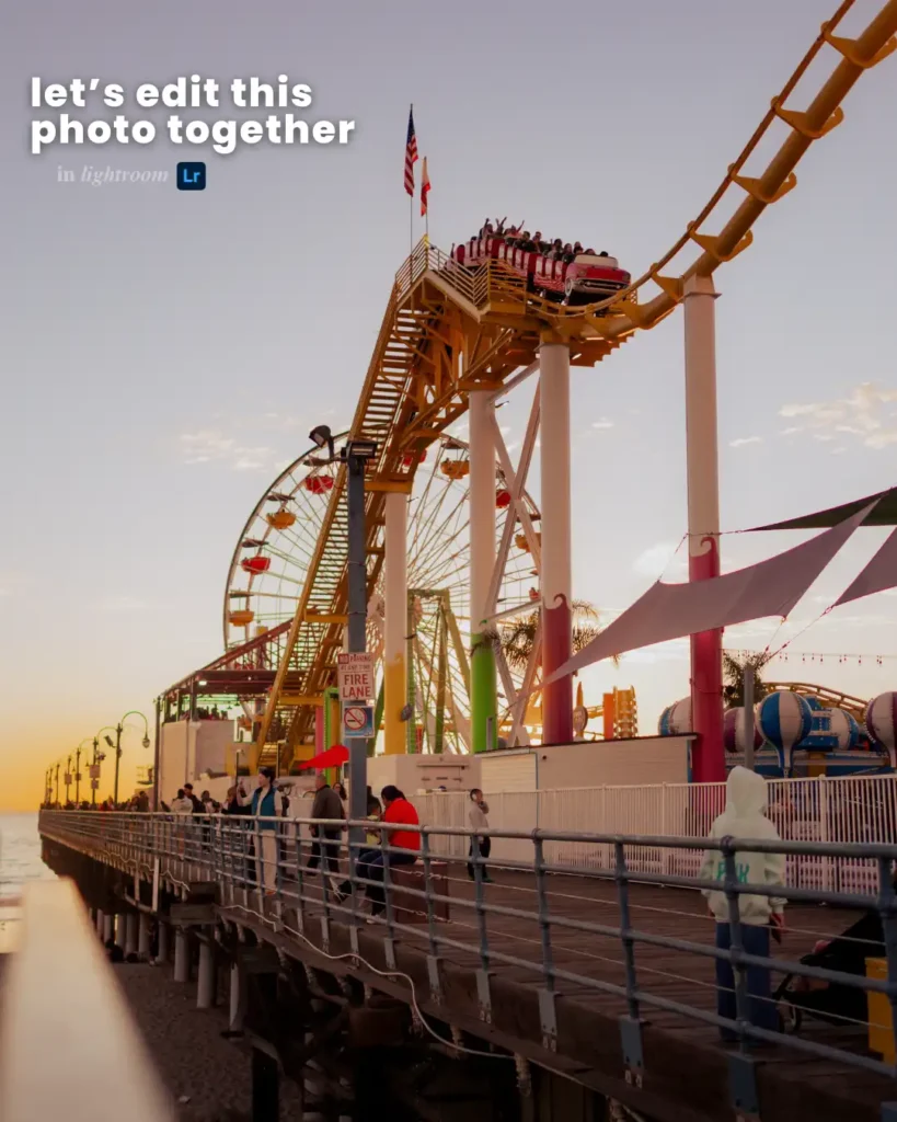
I’m going to walk you through how I edited this sunset photo at Santa Monica Pier using Lightroom. This is my real process. My real settings. The way I create that soft, warm, cinematic look you see on my blog and Instagram.
Step 1: How Do I Edit a Photo to Make It Look Better?
The biggest mistake people make? They start with color.
Don’t. Start with light.
Before touching anything else, I open the Basic panel in Lightroom and balance the exposure and contrast.
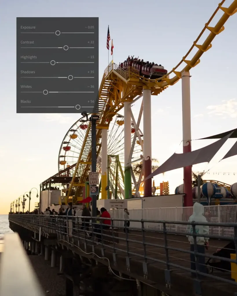
For this sunset image, I used:
- Blacks: +56
- Exposure: -0.05
- Contrast: +22
- Highlights: -15
- Shadows: +35
- Whites: -36
Here’s why this works.
Sunset photos usually have very bright skies and darker foregrounds. If you don’t fix that balance, the image feels heavy.
- Lowering highlights protects the sky.
- Lifting shadows brings back detail in people and structures.
- Lowering whites slightly prevents harsh brightness.
- Raising blacks creates that soft matte look.
- That soft black tone is what makes the image feel cinematic instead of harsh.
If your photos look too sharp, try lifting blacks slightly and reducing whites. It instantly softens everything.
Already, without filters, the photo looks better.
Step 2: Tone Curve – The Cinematic Foundation
If you want cinematic Lightroom settings, this is where the magic happens.
I create a gentle S-curve:
- Slight lift in highlights
- Slight lift in shadows
- Slight lift in the black point
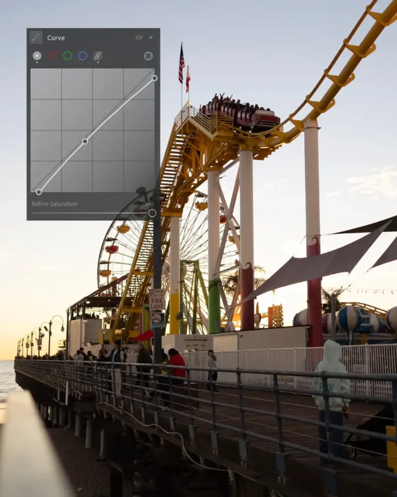
I don’t crush blacks. I don’t add extreme contrast.
The tone curve is what makes the image feel like film instead of digital. It removes that stiff, straight-out-of-camera look.
If your photo feels flat or too “camera-like,” tone curve fixes that.
Step 3: Fix White Balance (Warm But Natural)
Now we move to color.
For sunset editing in Lightroom, warmth is everything, but controlled warmth.
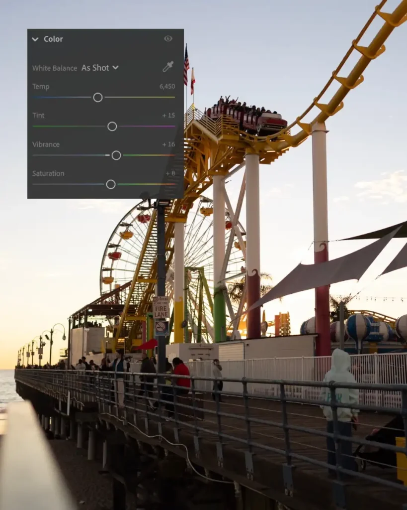
For this photo:
- Temperature: 6450
- Tint: +15
- Vibrance: +16
- Saturation: +8
I don’t push temperature too far. If you go too warm, the image turns orange and fake.
Vibrance is better than saturation because it protects skin tones. Saturation should stay low. Cinematic editing is not about bright colors. It’s about balanced colors.
If your image feels dull or gray, white balance is usually the issue.
Step 4: How to Fix a Poor Quality Photo
Sometimes the issue isn’t color. It’s quality.
Maybe the image looks:
- Grainy
- Too dark
- Was shot in low light
- Slightly flat
Here’s how I fix poor quality photos in Lightroom.
1. Don’t Overexpose
Instead of raising exposure aggressively (which adds more noise), balance highlights and shadows first.
Protect the sky. Lift shadows gently.
2. Use Contrast Carefully
Too much contrast makes noise worse. Too little contrast makes the image lifeless.
Small adjustments only.
Step 5: HSL: Controlling Colors Like a Professional
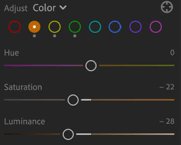
For yellows:
- Saturation: -22
- Luminance: -28
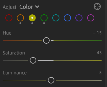
For oranges:
- Hue: -15
- Saturation: -43
- Luminance: -5
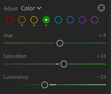
For greens:
- Hue: +8
- Saturation: +16
- Luminance: -23
Why reduce yellows and oranges?
Because too much yellow makes sunset photos look cheap.
When you mute them slightly, the image feels calmer and more cinematic.
Editing is not about adding more color. It’s about removing distraction.
Step 6: Color Grading for Depth
Color grading adds emotion.
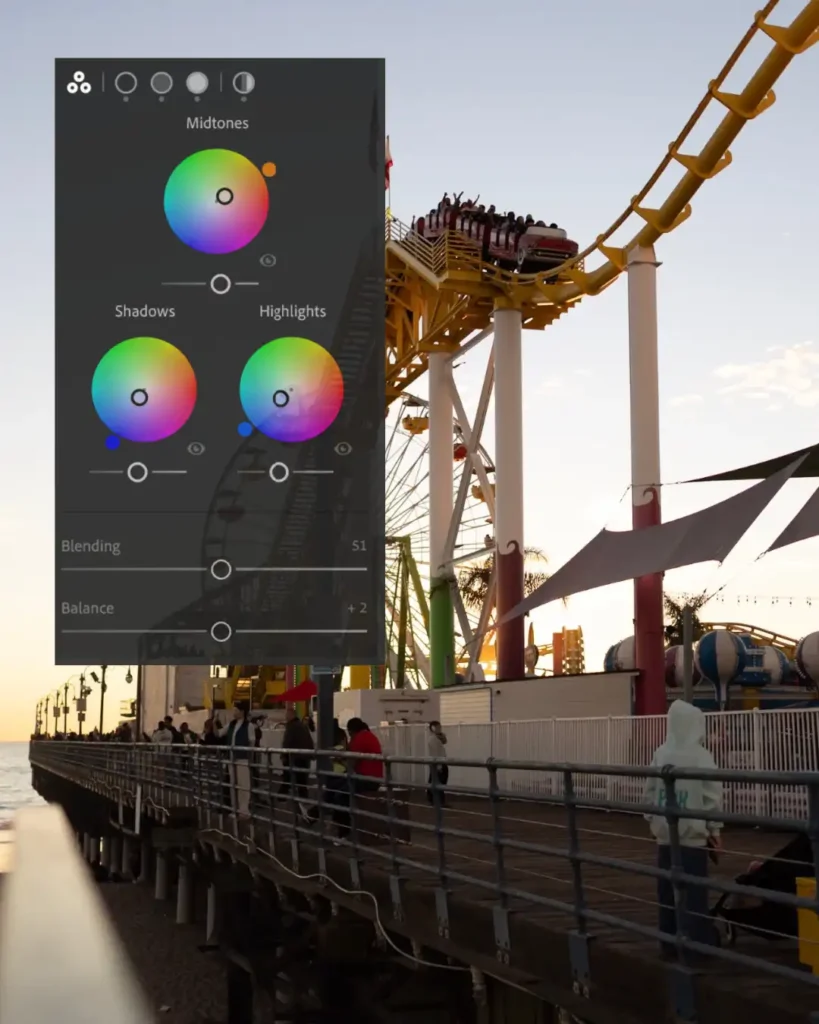
- Midtones: slightly warm
- Highlights: warm
- Shadows: very subtle cool blue
- Blending: around 51
- Balance: around +2
Warm highlights + cool shadows create depth.
This is one of my favorite Lightroom editing tips. It makes the photo feel layered instead of flat.
Subtle contrast between warm and cool tones creates dimension.
But keep it soft.
Too much color grading looks dramatic. I prefer simple and natural…sometimes vintage, but it doesn’t work with every photo.
Step 7: Noise Reduction in Lightroom (Without Ruining Texture)
Sunset means lower light. Lower light means noise.
Go to the Detail panel.
Zoom to 100%.
Then:
- Luminance: 15–25
- Detail: around 50
- Contrast: 0–10
- Color: 25–35
Never push luminance too high.
If you go above 40–50, the image starts looking smooth and fake.
Grain can actually enhance cinematic photos. Over-smoothing kills realism.
Noise reduction should reduce distraction, not remove texture.
Step 8: Photo Editing for Instagram
Instagram compresses your photos.
If your image is oversharpened or oversaturated before uploading, it will look worse after.
Here’s how I edit photos for Instagram:
- Keep clarity low
- Avoid heavy sharpening
- Slightly reduce saturation
- Keep contrast natural
- Export in high resolution
Step 9: How to Create a Lightroom Preset
Once you love your edit:
- Go to Presets
- Click “Create Preset”
- Select:
- Basic adjustments
- Tone curve
- Color
- HSL
- Color grading
- Detail (optional)
Name it something simple like: “Warm Cinematic Sunset”.
Now you can apply it to similar sunset photos and just adjust exposure per image.

My Rule About Photo Editing
I used to over-edit.
- Too much orange.
- Too much contrast.
- Too dramatic.
Now I ask one question: Does this feel like it felt when I was standing there?
If yes, I stop.
Editing should feel like a memory. Not a painting.
The camera captures light. Editing helps match the feeling.
Final Thoughts
If you’re learning how to edit photos in Lightroom, don’t chase trends.
- Build your eye.
- Use light first.
- Control color second.
- Reduce noise carefully.
- Keep it natural.
Cinematic doesn’t mean dark.
Professional doesn’t mean over editing.
Better doesn’t mean extreme.
It just means balanced.
And honestly, your style will come with time. The more you edit, the more you understand what feels like you.
That’s where real photography begins.
Mariam Megrdichian
📍 Location: Los Angeles, California, USA
📷 Photography, visual storytelling, cinematic life